04 / Data Visualization
NBA Playoff Player Explorer
Player comparison and shooting analysis
An interactive R Shiny app for exploring NBA playoff performance through player comparisons, percentile profiles, and shooting efficiency.
- Built with
- R · Shiny · ggplot2 · DT
- Dataset
- 2022–23 NBA playoffs
- Coverage
- 217 players · 16 teams
- Focus
- Interactive data visualization
The project
This project began as the final project for an R and data visualization course. I was interested in how basketball statistics could reveal differences in the way players contribute. The original app paired a radar chart with a statistics table; I expanded it into a tool for comparing players within an explicit reference population.
Comparing player profiles
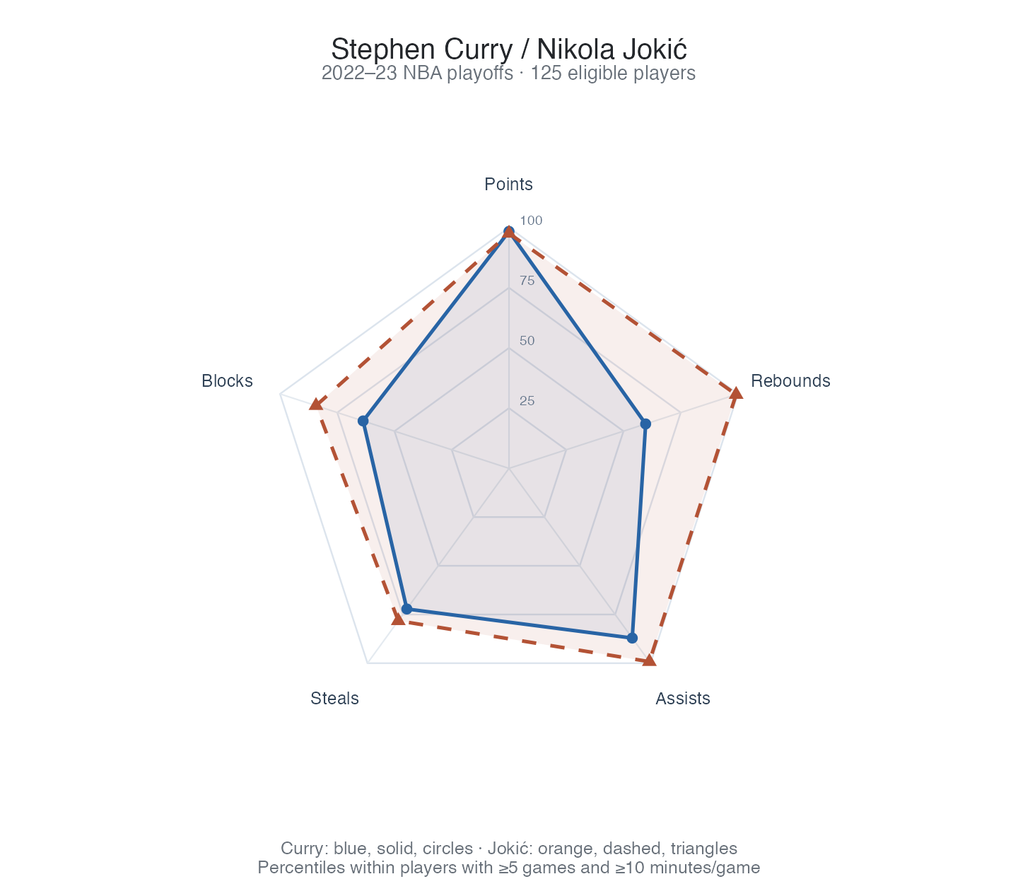
Choose two players and compare their production across all-around, scoring, shooting efficiency, and rebounding and defense metrics. The radar chart uses percentiles within the eligible population, while the table preserves actual values, signed differences, and the population median.
Team, position, minimum games, and minutes per game define the comparison population. Changing the players keeps that population fixed. Games and minutes remain visible alongside each player, so the sample behind the comparison is part of the view.
Shooting volume and efficiency
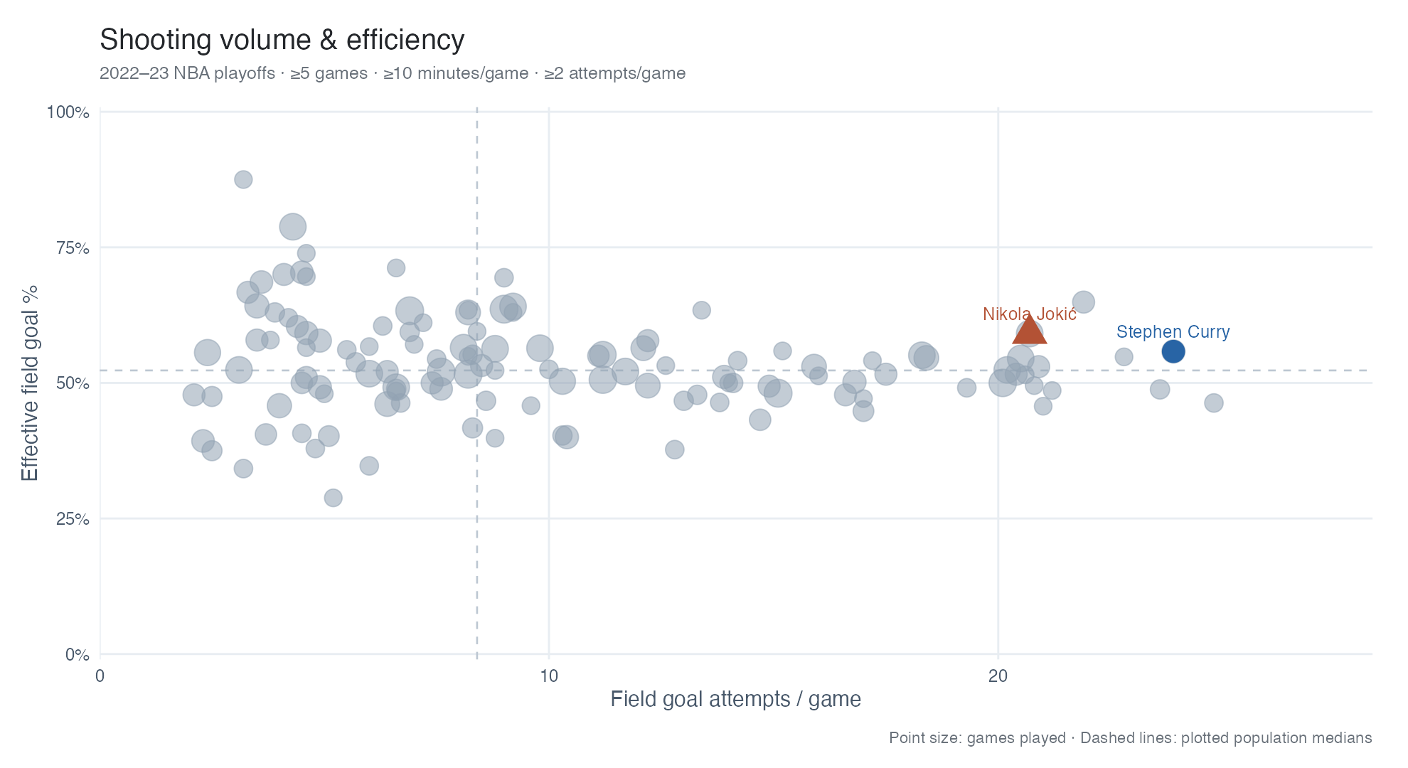
A scatter plot places field goal attempts per game against effective field goal percentage, highlighting the selected players within the wider population. Point size shows games played, and a separate attempts threshold lets the viewer restrict the shooting sample.
A searchable player table supports exact inspection and CSV export. The export follows the current population filters and table search; a separate comparison export includes raw values, percentiles, units, and filter settings.
Making the comparisons reliable
I corrected a decimal-parsing error in the original import that affected minutes per game, made the file encoding explicit, and documented repairs to damaged player names. Shooting percentages with zero recorded attempts are treated as unavailable rather than as measured zero-percent results.
The app documents its percentile calculations, preserves the original CSV, and includes dependency versions and regression checks. The data is a historical playoff summary: it supports descriptive player comparisons, while game-by-game trends and regular-season changes would require additional data.